We promise this is no normal case study. As you scroll through, it may get goofier. So we must warn you in the words of Warsan Shire.
“my otherness will spoil you, ruin you, after me, all else will taste redundant”
A brief intro, shall we?
Obiex is one of the largest crypto exchanges that serves people from diverse corners of the world. With the clear aim to drive widespread cryptocurrency adoption, it provides security and seamlessness.
With this in mind,
Simplicity drives all our UX and UI contributions to the product, and we hate it!😀 It makes our job 10x harder than it would have been if we didn’t have to worry about making sure everyone can use our products.
jk, jk, we love it for the same reason.
We’ll go ahead and admit it. This redesign was first and foremost an ego trip for the design team 👀
Naturally, our skills had far surpassed the current designs, which were created as the first MVP. We couldn’t tell peers we work at Obiex without cringing a few times.
Beyond that... the company was growing too and it had become important for us to update our designs to represent the current trajectory of the company.
To justify our decision, we decided to look inward (the team) and outwards (user behavior, feedback, and competitive research) to find just what we needed; not one but a truckload of UX issues!
Here’s the thing...
We started the redesign with the mobile app because we had more people using Obiex on their mobile phones than on the web.
After the mobile redesign, we added a few more features to the mix, and voila! we became proud designers again, with all the feedback (let’s focus on the positive here) from our new and improved look!
But we still had a bone to pick, because...
While our mobile app looked like this 🥺❤️
Our web app looked like this
Do us a favor and close your eyes, please 😢😫
But the look wasn’t the only thing that didn’t sit right with us
For our next trick, we’ll tone the goofy down a notch. Or at least we’ll try
We can all agree that designs are supposed to breathe, but we maxed out on our white space generosity here.
*Cue in cricket sound* We’re also not sure what we were thinking but in our defense, it looked and worked great at the time.
Bombastic side eye 👀
This is where we would have shown you our low fidelity wireframes, but we didn’t create any. We just took the bull by the horn
Bull. Crypto, get it?
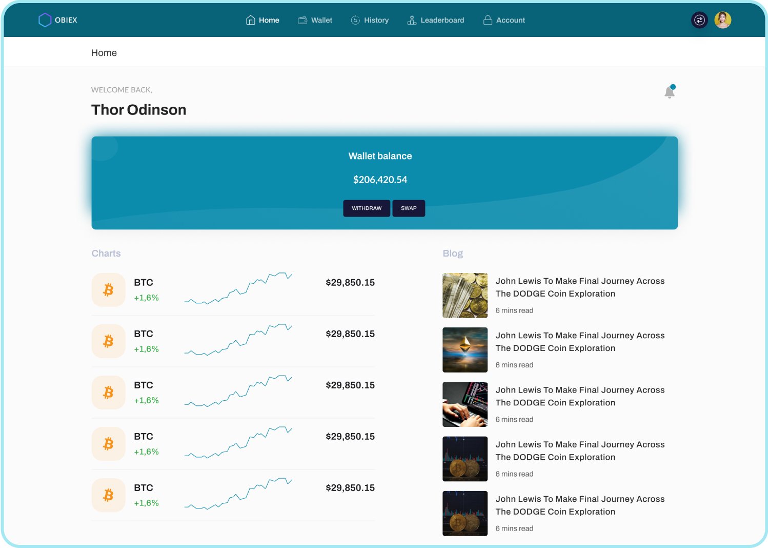
It’s not pride, take a look at our dashboard 🥹
Wallet
Settings
Surely, we didn’t forget to mention it comes in dark theme!
If you got to this point, you’re the real MVP!
While we would love to show you more screens, we have to stop here because this is already long enough and we can feel your growing impatience, as well as ours. Good news is that the web app is up and running! So go ahead and visit obiex.com to explore more of the UI and UX in real time.


